Thursday, May 2, 2013

Childhood Cartoons

Yesterday, I was reminiscing about the cartoons that I loved when I was a kid. The main two that I read religiously were Garfield and Peanuts. Garfield was created by Jim Davis and Peanuts was created by Charles M. Schulz.


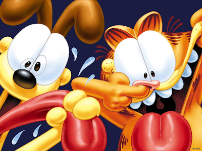
 As a kid I would always love to read the newspaper for the comics and read Garfield. The comic is about a car named Garfield who goes about his daily life doing whatever it is he likes. Some of the things he does is: eat lasagna, annoy Jon (his owner), mess with Odie (Jon's dog), and sleeps. Honestly, I loved Odie. When I was little until fifth grade I had a stuffed animal of Odie and I slept with him every night. Reading these comics brought back good memories. Unforutnately, one day my Mom accidentally sold Odie in a garage sale. It was one of the saddest days in my life.

Another comic I read when I was a kid was Peanuts!! This comic was hilarious and I absolutely loved Snoopy. Charlie Brown was a kid who went about his daily life trying his best to do anything, but somehow he just couldn't do it, mess up, or Lucy would trick him. Reading this comic helped me be more persistent and determined to do my best even though I would mess up sometimes. Essentially it taught me to never give up... and to get a beagle named Snoopy. Ha ha.

Both comics are amazing and I wouldn't have made it through childhood without reading them. They kept me entertained and out of trouble... for the most part.

Bride of the Water God by Yun Mi-kyung


I've read Bride of the Water God before and this semester I reread it for manga week. In class we were talking about manga and anime. One of my favorites to read was Bride of the Water God. I was surprised to find out that there were other types of asian graphic novels. During manga week, a group of students and I presented about Korean manhwa. While researching for the presentation, I fond out that Bride of the Water God wasn't manga, but in fact Korean manhwa. Learning something new every day. It was a weird feeling to find out 5 years later that it was Korean work and it is called manhwa and not manga. Both similar but different in some ways.

I love this series because of the folk tale that it includes. In Bride of the Water God, "The story of Habaek is one of the oldest myths in Korea and tells of the god of the great Yalu River." The main female character, Soah, was set up to marry someone in the village that she lived in but every year the village picks out the prettiest girl to sacrifice to the Water God, Habaek. Unfortunately, she was the one that was chosen to be sacrificed. The Water God ends up saving her. This manhwa entertains as well as educated others about the tall-tale of the Water God Habaek. Stories like these should always be published to keep the tales going. Reading about other cultures' folk tales are always interesting and fun.

Overall, it's a really nice love fantasy story. Personally, many of the novels and books I read are science fiction/ fantasy/ horror/ mystery genres. It's what I enjoy and the art in this manga is so detailed and beautiful. The line work is amazing and carries your eye around the page. So far, I only have the first four of this series, but I plan to buy more. Definitely going to keep reading.

Wednesday, May 1, 2013

A Contract With God by Will Eisner


A Contract with God was one of the most popular graphic novels in its time. Personally, I loved Eisner’s art style in the graphic novel. His use of art style and theme would catch anyone’s attention in a second.


This kind of comic book art style carries the reader through the story with its use of vignettes and line weight. Eisner utilizes a lot of vignettes and doesn’t really focus on creating panel artwork that are very structured and geometric. Eisner uses the vignettes to his advantage to create that a sense of flow and movement while reading the story that keeps you going from page to page. His amazing use of line weight is beautiful. Eisner manipulates different hatching, cross-hatching, and bold inking to catch the reader’s attention. The bold ink indicates a hierarchy between characters or is normally the focal point in the page. A Contract with God also has really good composition in all of the pages. Eisner’s use of bold line weight and loose panels create a good sense of unity and well-drawn composition.  As always appealing compositions accompanied with creative line weight and great inking would interest any reader.

In general, sad themes in stories tend to grab more attention than happier themes. When Will Eisner picked a “young, deeply religious Hasidic Jew Frimme Herse” to write about in a super sad depressing setting people would be more attracted to it than if he were a happy-go-lucky Jew that got everything he needed. Audiences love drama and tend to dwell on the negatives, unfortunately. Also, Will Eisner’s storytelling abilities are amazing.

A Contract with God has changed the perspective on graphic novels. Before it was published graphic novels weren’t all that popular. When Will Eisner created this novel, it really boosted the name and creation of the graphic novel to “infinity and beyond.”

Overall, the comic was really good. I loved the artwork and I can only wish to be as successful as Will Eisner in creating and writing graphic novels. Definite read!

Tuesday, April 30, 2013

Maus by Art Spiegelman


This graphic novel was pretty cool. Highly recommend reading it, although it is sad. Maus reminds me a little of Animal Farm written by George Orwell. Based off of the relation between animal types compared to certain races in the world, then yes the two are very similar.

What I found most interesting about Maus was the story. In general, I love reading because of the stories, not much for the images. Normally Holocaust stories are written via memoirs or through bibliographies not graphic novels. Reading his story through a graphic novel was a totally different experience. I know there have been movies directed with the troubles and experiences of World War II and documentaries about the Holocaust, but it is a different more personal experience reading and viewing the images about it. Movies tend to manipulate shots and limit the emotional experience by showing you what they want you to feel/experience. Maus allows you to feel whatever you want. There are no colors or sounds to heighten emotions only pictures and words. The images are really strong and "in your face" with violence, which is scary and sad to think that this really happened.

The relation from Animal Farm to Maus is clearly there or at least the concept of comparing specific races to animals. In the graphic novel: the Jews are represented as mice, the Nazis are represented as cats, and ethnic Polish people are represented by pigs. In Animal Farm: the different working class Russian people are represented as horses, goats, sheep, chickens, cows, and cats. The upper class was represented as pigs.

Both stories talk about two very important events in history that wil never be forgotten because of how many ways it has been interpreted through film, comics, novels, graphic novels, or songs. The different use of media about important topics in history allow us to remember and relive what happened; so we never forget what happened and repeat history in that way again.

Overall, read it. You won't be disappointed. It is a great experience.
Thursday, February 28, 2013

Understanding Comics


Scott McCloud's TED Talk about comics really helped me understand the thought, proces, and hard work of creating a comic. I've always been interested in comic strips but comic books, not too much. This year that has changed a bit because of this class.

Scott McCloud is a comic book artist and cartoonist. A lot of what he has to say is very relevant and important to any artist out there whether they are a comic book artist or not. He helps one understand the shape of the future. He talks about there being three types of vision: vision based off on what one cannot see vision of the unseen and unknowable, vision of that which can be already be proven or that of which can be ascertained, vision of something which can be, which maybe based on knowledge, but is as yet unproven. The last vision is where the artistic and scientific visions lie. We all have these ideas and theories of visions, but most haven't been proven.

McCloud also speaks about there being four basic principles to follow: learn from everyone, follow no one, watch for patterns, work like hell. The third is where we can identify new ideas and learn to understand them. Four different ways of looking at the world and the world of comics are: classicist (beauty and craft), formalist (trying to understand how it works), animist (pure transparency of content), and iconoclast (authenticity of human experience and honesty). Watching and listening to him talk about understanding comics hasn't just opened my eyes to reading comics, but my perspective on the world as well. How people think. What to look for. To create a sequence of images that won't break the magic of the imagination.

"Comics are a visual medium but they try to embrace all the senses in it. Comics give you a vision to see what's in the panels and something to imagine what is between the panels. Sequence is a very important aspect of comics." Example of other sequences are hieroglyphics. Most of the early comics have simple line drawings without tone, but they work because of the clarity in the sequence of events. "Each of them has a single unbroken reading line, as you move through space you move through time." This quote was my favorite in the video. The fact that he figured understood that if we viewed the monitor as window, it won't break the continuous reading line in comics or stories. Pretty darn cool.

He has a lot to say and I enjoyed every minute of it. If anyone is interested at all in comics, storytelling, illustrations, or art in general; then this is the video for you.

TED Talk- Scott McCloud

Cheech Wizard by Vaughn Frederic Bode


Cheech Wizard, created by Vaughn Bode, is hilarious and very entertaining. This underground comic has been very interesting to read. What a trip. Underground comics seriously have no boundaries to what content they are going to show. That's what's so awesome and creates interesting situations. It's an fun concept to play with too because you could illustrate and write about anything you would want to.

What drew me Cheech Wizard the most was the character itself. Cheech is a hat with legs who masquerades as a wizard. So far from what I've read he hasn't done that much magic or close to any at all, but it is still entertaining to read. The other characters in the comic are equally as intersting and unique, but Cheech is my favorite. My second, favorite would have to be his lizard apprentice, Razzberry. At first, I had no clue that he was a lizard, until many panels later.

I had to keep reading to find out what Cheech really looks like. It's a mystery. This mysticism of Cheech's identity adds interest to the comic because you don't find out! There is a point where I thought Bode was going to show us what he looks like, but instead it was just a blank panel. So mean. Not really, but I still like it a lot.

Nudity warning for people who would like to read this comic. I didn't mind it, I thought it was funny and adds to the quirky quality of Cheech Wizard. Really funny and a good read. Definitely would recommend this comic to anyone willing to read it. Ha ha.

Calvin and Hobbes by Bill Watterson


Calvin and Hobbes, created by Bill Watterson, is one of my favorite comics because of its artistic style, design sense, and humor. These attributes also make it very popular and is one of the most-liked comics around, at least where I grew up. It could be that I grew up with a lot of awesome nerds, too. :)

Watterson's artistic cartoon style and watercolor technique is what draws my attention the most. He doesn't just use the generic bold black cartoon line with flat bright colors. Watterson utilizes the bold black cartoony line in specific areas to create shapes of color. The color itself has character and isn't just one value; it has multiple values within itself. This is one of the reasons why I find watercolor to be a beautiful medium to use.

His design sense with the color shapes in each composition is portrayed well. The graphic bold line carries you in and out of areas throughout the image. Items in the foreground and middle ground are normally outlined in the bold black line to emphasize objects in the picture to give it a sense of space and depth. This spatial awareness also helps with his design layout.


Not only is the comic amazing to look at, but it is very entertaining to read as well. Calvin and Hobbes is about a little boy and a tiger that like to go out and go on adventures, I must warn you it is very cute. I love the concept of a little boy and a tiger being best friends doing everything together because in reality that's just not possible, but it's entertaining to think about. In the comic everyone views the tiger as a stuffed animal, but Calvin sees him as a best friend that's alive.

In conclusion, I loved reading these comic strips. They are awesome, cute, and funny. Worth the time to sit down and laugh.

Little Nemo in Slumberland by Winsor McCay


Winsor McCay was a cartoonist and most known for his comic strip called Little Nemo in Slumberland. These comics were printed in both the New York Herald and New York American newspapers. McCay's artistic use of color, texture, and style all make this comic very successful in it's appearance. Not only is it aesthetically pleasing, but the storytelling and concept of Little Nemo in Slumberland is great.

McCay's use of color is captivating. He uses bright saturated colors to capture your interest through out the picture and pays attention to his choice of the colors' value at the same time. Personally, I'm more attracted to his use of line weight and style of inking. Nonetheless, he tends to stray away from rendering objects, which I find interesting and very intriguing. The flat color is much easier to work with and great for comics. He uses line weight and chooses color very carefully in his illustrations. For example, the woman in polka dots on the right has very little rendering in her clothes and body in general. McCay uses the line weight and flat saturated colors along with detailed line picks to create her form. His use of slight color variation differentiates her skin tone but other wise she remains the same value all around, with the exception of her blouse and the dots to add appeal. McCay utilizes the importance of the value of colors to his advantage. If you squint your eyes, the brighter values in color stand out more. This allows your eye to jump around and appreciate his attention to detail rather than getting stuck on one spot that is overly rendered. In most of the strips Little Nemo is in his white pajamas because it makes him stand out from everyone else, which helps the reader always know where he is. His style in general and especially his watercolor skills are inspiring as well.

Not only is McCay's artistic ability stunning, but his concept and overall storyline for Little Nemo in Slumberland is amazing. How he came up with the idea, we will never know. Everyone dreams, whether you remember them or not. So this comic can relate to anyone. It has a greater audience than most comics. It is easy to read and visually appealing. Most of the strips have such good storytelling features through images that the need for words to explain what's going on isn't necessary. Notice how in the image McCay uses only three speech bubbles. Though there is only a limited amount of words the pictures let you know exactly what is going on and portray the idea clearly. He has a great talent for geting his point across with limited amounts of words and lets the image speak for itself.


Overall, I love Winsor McCay's work and I love this kind of watercolor and inking style. It's very interesting, successful, and attractive to look at. I would definitely recommend any of McCay's work and comics to anyone.

Sunday, February 24, 2013

Une Semaine de Bonte by Max Ernst


Here is my imaginative interpretation of Max Ernst's Une Semaine de Bonte.

The women and birds could possibly signify fertility. The women are dying because they have slowly become non-fertile. Thus being said, a witch preforms a ritual to mate with a rooster demon to try and save mankind. The demon comes in her sleep and implants an egg in her womb. Eventually before she dies, she gives birth to this demon rooster child.

Now, the rooster men start to take over and they force women to repopulate with them. By using their human genitalia to reproduce and create their own demon rooster human species, over populating the human race. They keep the women in dungeons and torture them for whatever reasons they deem necessary.After that, the women create a secret society and rebel against the rooster men.

Max Ernst was an artist that was inspired by his dreams. In general, reading or viewing how other artists portray their dreams is always entertaining. Another popular example would be Salvador Dali. It is like a little doorway into what's going on in their heads. Some of the things seen are wacky, but for the most part awesome! Dreams have been about for forever and help us in many ways of expressing how we feel, what we're thinking, how to fix things, and help our learning processes. Very interesting to view and interpret Ernst's images. As the saying goes, "don't knock it until you try it."

The Arrival by Shaun Tan


The Arrival by Shaun Tan is a pantomime comic, meaning there are no words. It is a beautiful silent comic. For pantomime comics to be successful, good storytelling skills are a necessity. The square frame, high attention to detail, and well thought out storyline helps the reader easily understand and enjoy the comic.

The drawings themselves are aesthetically pleasing. The realistic drawing of this fantasy world is intriguing because it looks like it could be believable. It must have taken Tan a good long while to complete the comic because of the amount of detail. Essentially, the frames in the comic are illustrations themselves, which is another plus. You could quite literally pluck out one of the images, frame it, hang it on a wall, and say it's done.

Personally, I find black and white illustrations or limited color images more appealing than anything else. The fact that Tan chose to keep his comic black and white in sepia tones adds a pleasing quality. The vintage or antique look allows the reader's eye to move comfortably and flow easily from frame to frame. It also allows the eyes to take in more information and appreciate his time spent on detail. Pictures of the past aren't normally in color, so the black and white illustrations are appropriate to the subject matter and storyline. They almost certainly done purposefully.


The storyline is clear and easy to understand, which is another reason why the comic is awesome and very successful. It doesn't just describe the story frame per frame but also leaves room for imagination in between the frames. The comic is all about immigration and learning how how to settle in a new world. A man travels to a new world, meets other immigrants like himself, adjusts to the lifestyle, then reunites with his family, and they all live happily ever after in the new world.

Overall, very good comic and I would highly recommend it.